
Hoof Beats – On Track – March 2018
Welcome back On Track! In this month’s newsletter, all about the March 2018 issue of Hoof Beats, we have a brand-new look! Below we share went we were up to for the past 10 months to bring you an even better-looking harness racing magazine. Enjoy! -TJB

Check out the New Design!
The March 2018 issue of Hoof Beats marks the beginning of our 86th year in publication.
Much and more has changed in the sport since that first magazine in 1933, but Hoof Beats has remained a steadfast source of news, information, and entertainment about harness racing. The stories in Hoof Beats are meticulously researched, designed, and presented, making the magazine a timeless exhibition of the sport we all love.
In an effort to curate that “timeless” feel, we have spent the past 10 months redesigning the entire magazine. Led by art director Gena Gallagher with assistance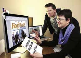 from graphic designer Jason Turner (both at right), we have changed everything from the page layouts to the logo to make this magazine feel as approachable and relevant 10 years from now as it is today.
Below, Gena explains our process:
We had several goals in mind with the latest Hoof Beats redesign:
• provide a fresh reading experience for our readers;
• make the magazine more readable than it already was; and
• trade in its sporty and busy look for a more simplified, casual, and elegant one.
We were able to achieve these goals in the following ways:
Fonts:
In researching fonts, we looked for ones that were easy to read, and also available in enough weights (i.e., very thin to extremely bold) to convey varying style moods, such as elegant, playful, sporty, casual, or serious. We chose two families of fonts—Publico (the text version of which you are reading now) and Guardian—that were designed to work together. This allows us to create visual interest without the risk of the fonts ever fighting each other on a page (which can happen with poorly paired fonts).
Several things make both of these font families highly readable.
First is what is known as x-height, or the height of the lower-case letters compared to the height of their capped versions, as shown below. The higher the x-heights are, the larger the lower-case letters are—and hence the easier the reading experience is, particularly when it comes to reading body copy.
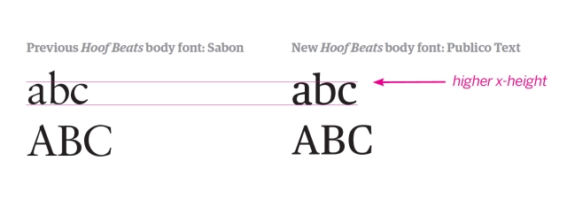
Second, the letters in both fonts have a slightly squarish shape, which creates a horizontal flow that’s easy for the eye to travel over.
Layout:
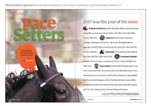
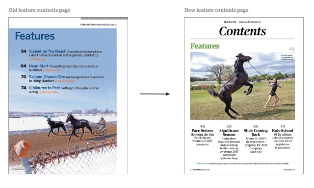
In designing the layout, we opted for simplicity, openness, and little ornamentation, letting the fonts and photos do much of the work. We added fine rules between text columns for a touch of elegance and as a way to pull the editorial pages together, but also introduced more white space to give the magazine a casual, relaxed feeling. We will continue to utilize large photos whenever possible to showcase the beauty and action of our sport.
Color:
We pulled back on our color palette to help maintain the simple elegance of the layouts. Previously, we had assigned custom colors to some stories. But now the magazine will sport a more cohesive look because of the simplified color flow.
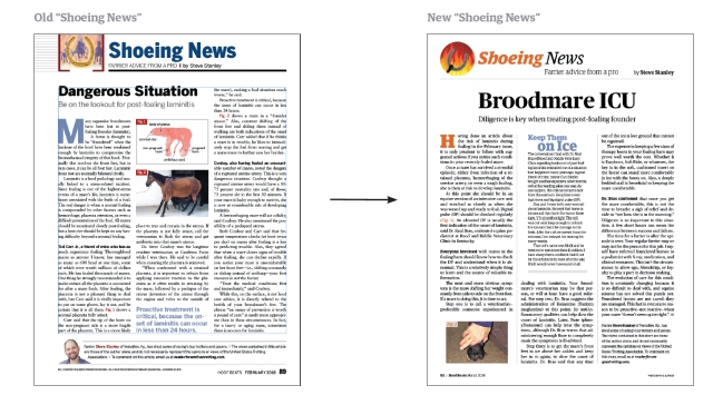
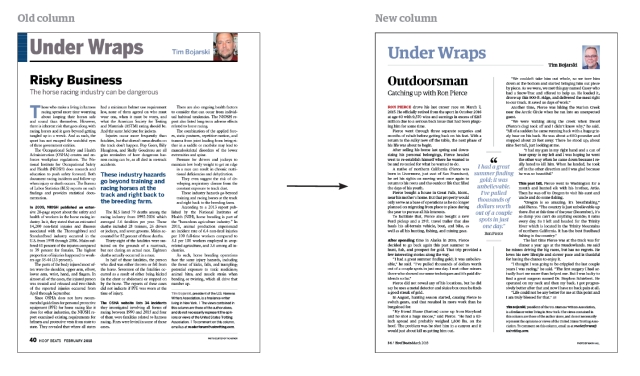
Here are some examples of the new layout, some paired with their previous design counterparts.
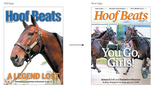
Hoof Beats logo:
Keeping within our two new font families, we chose a version of Publico for our new logo. The italicized treatment evokes action, yet still conveys the combination of playfulness and elegance that now underlies the entire magazine.
This logo replaces the Hoof Beats logo that had been in use since January 2007, which replaced the logo in use starting in September 1986.
T.J. here again. What do you think? What until you see it on paper. It just feels right, like the magazine has always looked like this.
And as the look of the magazine changes, the scope and focus of the magazine will continue to be honed as well. The magazine will focus on helping those in the industry—particularly USTA members—participate in the industry at their best level. This focus on best practices will range from how-to articles, to stories on how horses overcame injuries and how those lessons can be adapted, to articles about how various segments of the industry conduct their business and why.
We are really excited to bring you this brand new book with a brand new look. Hope you enjoy it!
Cheers,
T.J. Burkett
Executive Editor